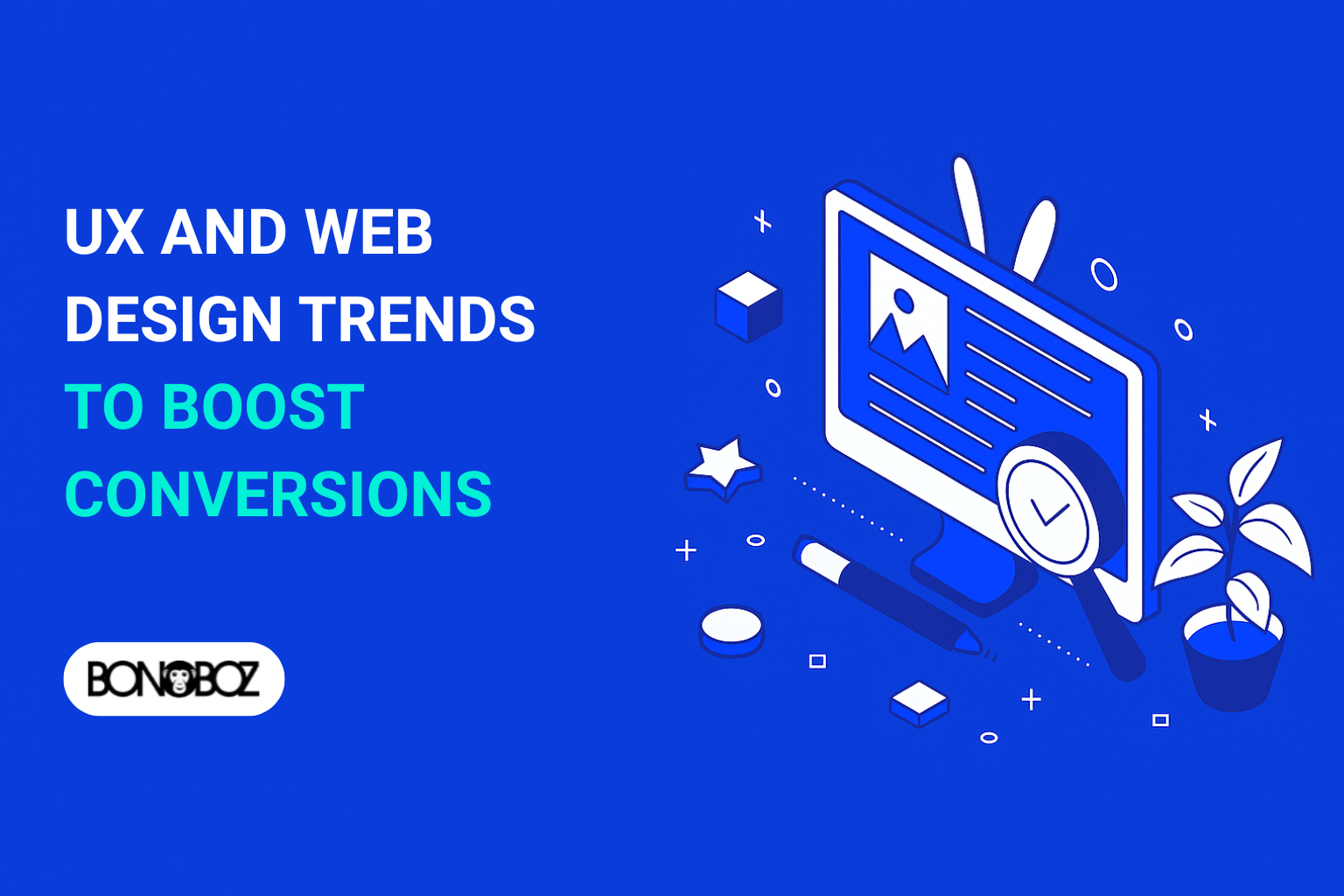
Indian buyers want fast, clear, and trustworthy websites. By 2025, user experience design will meet these needs. A good website design can increase conversions by using clean designs and measurable results.
A modern Web Designing Company combines strategy and creativity. They use mobile-first layouts, inclusive patterns, and AI insights. This helps brands grow their online presence in India’s B2B markets.
Teams use proven tools to achieve success. Figma helps create systems and components. WordPress supports content and growth. Google Lighthouse and WebPageTest track performance to show real customer and CFO benefits.
This guide will show how design choices affect conversions. It explains how user experience design leads to more leads, smoother checkouts, and stronger trust. All without adding extra steps.
Key Takeaways
- Mobile-first, inclusive website design is central to boost your conversions in 2025.
- User experience design choices link directly to lead volume and order value.
- Design elements, motion, and content work best when guided by data and testing.
- Figma, WordPress, Google Lighthouse, and WebPageTest enable measurable gains.
- A Web Designing Company can align web design helps with real B2B outcomes in India.
- Stronger online presence comes from fast pages, clear copy, and accessible flows.
Web Design Trends 2025: How UX Shapes Conversion
In India’s digital market, buyers quickly scan and make decisions. The latest web design trends focus on clear structure, fast feedback, and honest messaging. This approach reduces friction and boosts conversion.
Brands are now focusing on usability that people feel, not just see. This is key to web design trends 2025 and modern UX trends.
Why user experience drives conversion rate in 2025 web?
Simple, stable, and quick pages make it easier for visitors to complete tasks. Studies show that clear and consistent designs lead to fewer errors and higher success rates. Google’s Core Web Vitals reward speed and visual stability, helping to reduce bounce rates and support conversion across devices in India.
Teams using measurable UX trends—like readable typography and scannable layouts—reduce cognitive load. McKinsey’s research shows that strong design maturity leads to better revenue, highlighting the impact on UX and business. These insights are central to the design trends in 2025 conversation.
Top web design trends influencing digital experiences
- Mobile-first layouts that prioritize thumb zones and quick actions, aligned with web design trends 2025 and current trends.
- Accessibility by default, inclusive color choices, and keyboard flows that raise trust and conversion.
- Dark mode options tuned for contrast, supporting comfort without noise in the latest web design trends.
- Performance-safe motion and micro-interactions that guide focus while protecting Core Web Vitals.
- Conversational UX with clear intent labels, not gimmicks, reflecting practical UX trends.
- Privacy-aware personalization that uses first‑party data responsibly, key among future trends.
- Data-driven experimentation—A/B tests that validate the impact on UX and lift.
From bad UX to great UX: impact on UX and business outcomes
Common blockers include confusing navigation, hidden pricing, and intrusive pop-ups. These patterns derail sign-ups and inflate support tickets. Clear labels, transparent plans, and respectful prompts improve task completion and trial-to-paid conversion.
For B2B teams in India, cleaner flows reduce sales friction and shorten cycles. When design trends in 2025 meet real buyer needs—fast pages, clear offers, safer interactions—the impact on UX multiplies. This is where the latest web design trends become measurable outcomes, not just looks.
Mobile-First Design and Responsive Design for Higher Conversion Rates
In India, most people start on phones. So, teams must focus on mobile-first design. They make sure layouts, type, and touch work well on mobile devices. This approach also makes sure the design works on all screens.
When designs fit well in the hand and eye, brands gain trust. This leads to higher conversion rates.
Design principles for mobile devices and app design
Make tap targets big and easy to hit. Keep text easy to read and space things out so thumbs don’t get in the way. Use app design patterns for the web too.
Use a grid that scales, colors with enough contrast, and spacing that works on all screens. This keeps responsive design consistent from the start.
- Use readable typography at small sizes with predictable line length.
- Reserve safe zones around CTAs and forms to reduce input errors.
- Apply component states that signal feedback instantly on touch.
Optimizing navigation and user journey on small screens
Guide the user journey with short paths and clear labels. Use sticky headers, bottom navigation, and progressive disclosure to make things easier on mobile devices. Keep menus simple and put the main CTA where it matters for higher conversion rates.
- Prioritize the top tasks; hide the rest behind simple drawers.
- Group related actions and keep thumb reach in mind.
- Match field types to inputs, like numeric pads for phone or OTP.
Load time, performance, and seamless interactions
Faster load time means more engagement and sales. Compress images, lazy-load content, and defer scripts. On slow networks, smooth transitions and cached routes keep things flowing well.
- Adopt server-side rendering or static output for first paint speed.
- Prefetch likely next pages and use CDNs close to major Indian metros.
- Trim JavaScript, contain CSS, and measure with Lighthouse and PageSpeed.
By combining mobile-first design, strict design principles, increased Page Speed and a lean performance stack, teams create responsive design. This design respects the context and boosts higher conversion rates where it counts.
Dark Mode and Low-Contrast Aware UI to Reduce Eye Strain
In India, people often browse late at night or during long commutes. They find dark mode helpful. It can make screens easier on the eyes, help focus, and make things more user-friendly. But, it’s important to get the colors right to save battery on OLED screens.
Good dark palettes respect hierarchy and clarity. Stay away from solid black backgrounds that can cause eye strain. Make sure text is clear on different layers. Keep your brand’s colors in mind, but make sure links and other important elements are always visible.
When dark mode improves usability and accessibility
Dark themes are great for reading in the evening or during power cuts. They make it easier to use your device when it’s dark. Make sure everything is clear and easy to use, even for people using keyboards or screen readers.
- Maintain sufficient contrast for body text and controls in the user interface.
- Use elevation, overlays, and soft surfaces to separate cards, drawers, and sheets.
- Keep brand accents legible on both backgrounds to support inclusive ux.
Design choice: reduce eye strain without hurting readability
Make sure text doesn’t glow or blur. Use bright colors for important actions and alerts. Avoid using gray on gray. Use colors that work well in both light and dark themes to keep your eyes comfortable.
- Test headings, paragraphs, and captions for scannability at typical Indian ambient lighting.
- Ensure links and error states remain distinct under hover, focus, and pressed states.
- Provide a visible toggle and remember the user’s design choice across sessions.
Design tools and testing for inclusive UX
Use tools like Figma with Able or Stark to check contrast early. Use Adobe Color to check accessibility. In your code, support prefers-color-scheme and remember user preferences.
- Run automated audits with axe DevTools and WAVE, then confirm on real devices.
- Review in bright sun and dim rooms to catch eye strain risks in the user interface.
- Iterate with Android, iOS, and desktop patterns from Google Material and Apple Human Interface Guidelines for consistent, inclusive ux.
Accessible Design and Inclusive UX That Boost Conversions
Accessible design helps reach and trust across India’s diverse audience. When teams include inclusive Website UX from the start, tasks are done faster. This leads to more conversions without using dark patterns.
Clear language, steady UI patterns, and strong usability make web experiences feel predictable and safe.
Standards set the baseline. W3C WCAG 2.2 and EN 301 549 guide inclusive design principles. This ensures pages are perceivable, operable, understandable, and robust. The Government of India’s GIGW and the Rights of Persons with Disabilities Act add local rigor for public sites and services.
Start with semantic HTML and use ARIA only when needed. Keep a visible focus state, logical focus order, and keyboard access for every action. Ensure accessible color contrast, adequate line height, and clear form labels with helpful errors.
Use skip links, captions, and text options for tables, charts, and media. This improves usability and supports the best UX.
- Mark up headings and landmarks for consistent UI navigation.
- Offer accessible PDF replacements or HTML versions for long docs.
- Support Hindi and regional languages with lang attributes and correct script rendering.
- Keep microcopy plain; confirm patterns with real users before scaling web experiences.
Test early and often. Pair automated scans with screen reader passes in NVDA, VoiceOver, and TalkBack. Validate keyboard-only flows and add user testing with people with disabilities.
These inclusive design principles reduce friction. They help teams boost conversions while improving day-to-day web experiences for everyone.
Modern Layouts and Scannability That Guide User Actions
Clean structure makes it easy for people to scan and act confidently. A modern layout sets the story, while clear copy and bold cues keep focus. In India’s fast-growing web market, teams that mix ui design with smart development patterns do well on landing pages.
Layout patterns that boost conversions on landing page templates
Begin with familiar patterns. F-pattern and Z-pattern scanning help with quick reads. Place important information, evidence, and a single action along these paths.
Use modular cards with CSS Grid or Flexbox to keep content organized on any device.
- Lead with a sharp promise, backed by one key benefit.
- Use short blocks, clear subheads, and supportive visuals.
- Reserve one bold primary CTA; keep secondary actions subtle.
Brands like Stripe use simple pricing tiers and clear next steps. Basecamp’s narrative landing page shows the power of a focused layout. Freshworks offers B2B flows popular in India, with clear modules that reference real tasks.
Above-the-fold strategy, visual hierarchy, and ui design
The first screen must be impactful. State the value, show proof, and provide a single action. Use strong contrast and ample whitespace to create a calm hierarchy.
- Place headline, short subtext, and primary CTA above the fold.
- Avoid carousels for core messaging; use a static hero that loads fast.
- Align color, type scale, and spacing with design tokens for speed.
This approach supports accessibility and consistency across teams. It also shortens cycles in development, since tokens keep typography and color steady across landing page templates.
Website design examples that maximize conversions
Look for website design examples that balance clarity with momentum. Stripe’s clean charts, Basecamp’s story blocks, and Freshworks’ regional cues show how a clear design trend can meet local needs and maximize conversions.
- Use social proof blocks near CTAs to reduce doubt.
- Stack features as scannable cards, not dense paragraphs.
- Support all breakpoints with Grid and Flexbox for resilient ui design.
When every section has one job and one clear action, the layout guides the user. This is how modern web teams connect message, design, and development without friction.
Motion Design and Micro-interactions That Enhance UX
Smart motion design makes clicks clear. It guides users smoothly from start to finish. In India’s fast digital world, motion is key. It should be immersive yet quick, aiming to boost sales without slowing down.
Using animation to guide user and drive conversions
Motion helps show what’s happening on the screen. A button press can make a ripple effect. A card can open up, and a form field can show it’s correct with a small tick.
These small animations help users feel sure and follow the right path.
- Confirm add-to-cart with a brief badge pop and count update.
- Show progress indicators on checkout to reduce drop‑offs.
- Employ skeleton screens so content feels immediate and immersive.
Timing is everything. Use short, natural beats. Make sure everything moves smoothly and clearly, so users know what to do next.
Performance-safe motion on web pages and WordPress
Speed is key. Use CSS for animations to keep things smooth. Always respect users who prefer less motion.
- On wordpress builds, choose lightweight libraries such as GSAP with trimmed bundles or Framer Motion for React fronts.
- Defer non-critical scripts and compress large Lottie assets before shipping.
- Profile with Chrome DevTools and Lighthouse, and keep Core Web Vitals in the green.
Short, consistent motion is good for brands. It works well on devices common in India.
Design trends like subtle transitions vs. distracting effects
Go for quiet elegance over loud effects. Trends now favor simple page changes and gentle hovers. Focus rings help guide the user’s eye.
- Use easing that feels natural, not flashy.
- Limit concurrent animations to protect focus and drive conversions.
- Let motion clarify steps, not compete with content or CTAs.
When motion matches user intent, users move faster and trust more. This is what modern teams need to help users make decisions.
Best Web designing company
To find the best partner in India, look for proof. A good Web Designing Company should show clear improvements in conversion rates and faster site loads. They should also have strong Core Web Vitals for various industries.
Ask for case studies that show lead volume, checkout success, and session depth. A top team views contemporary web design as a key business tool, not just a cosmetic update.
Check the scope of services offered. A top company will handle UX research, content design, and accessibility audits. They should also be skilled on WordPress Development or headless CMS for builds. For growth, they should use A/B testing and analytics.
Look for a team that’s fluent in tools like Figma, Storybook, GitHub, and Lighthouse CI. They should have clear processes for design, review, and quality checks. Data privacy and consent must follow Indian and global standards.
It’s important for a company to understand local needs. They should know about regional languages, telecom, and UPI. For fintech, they must follow RBI and SEBI rules. For b2b, they should map sales cycles and CRM hygiene.
Choose a company based on clarity and teamwork. They should have clear pricing, SLAs, and a team that works together. A good Digital Marketing Agency will link every milestone to business goals and keep an experimentation list open to your team.
In interviews, ask how they find and fix drop-offs. Ask about their approach to performance budgets and accessibility at scale. Their answers should show a method that works for your business. With this approach, you can find the right partner and elevate your website.
Content Design, UX Writing, and Trust Signals for B2B Web Design
B2B buyers often skim first and then read later. So, content design must quickly show value. Use simple words, short sentences, and action verbs. Align headlines with outcomes to boost conversions.
Let design elements help with scannability, not distract. This makes the user journey better from first visit to demo request.
Show outcomes, not hype. Mention the metric, audience, and payoff clearly. Pair concise copy with clear buttons and tight form labels. In b2b web design, fewer fields and inline help build trust.
Clarity over clever: messaging that boosts conversion
Start with a headline that offers value, a one-line proof, and a clear call to action. Replace jargon with everyday language. Use bullets to show features as benefits, backed by important numbers.
- State the promise: time saved, risk reduced, or revenue gained.
- Use active voice and front-load the verb to maximize conversions.
- Keep paragraphs under three lines so design elements stay readable on mobile.
Social proof, security badges, and pricing transparency
Risk signals slow B2B deals; visible proof speeds them up. Add named testimonials with company logos, verified ratings, and case studies. Display SSL, ISO 27001, PCI DSS, and RBI compliance badges near pricing and forms.
- Publish SLA highlights, refund terms, and support hours.
- Offer pricing tiers or a calculator with INR and GST clarity.
- Show a short FAQ under pricing to improve the user path to checkout or contact.
Design in 2025 for different web audiences in India
Plan for bandwidth variance and language needs across a different web landscape. Ship fast pages, readable fonts, and accessible contrast. Support English plus key regional languages where relevant, use metric units, and set INR by default in tables and forms.
- Localize examples and screenshots for Indian workflows.
- Use structured headings, bullets, and simple forms to fit diverse contexts.
- Balance content design with performance so web designers can scale updates without rework.
Bottom line for 2025: plain-language copy, credible proof, and transparent pricing—delivered through disciplined design elements—are the B2B stack that drives trust and steady conversion lifts.
Personalization, AI, and Data-Driven UX Research
Indian users want fast, clear, and relevant content. Personalization with AI makes this possible. It tailors content and offers to each user’s needs.
A data-driven design approach improves UX. It ensures websites are fast and stable for all users.
Analytics like GA4 and Mixpanel track user experiences. Heatmaps from Hotjar show where users struggle. This helps improve the site.
Run tests to see how changes affect users. Use tools like Hotjar to see how users interact with your site. This helps make your site better for everyone.
Before testing, set clear goals. Track important metrics like bounce rate and CLS. This ensures changes are good for the site.
Use tools like cohort analysis to understand user behavior. This helps make your site better for different users.
Try things like predictive search and personalized onboarding. These features make your site more useful for users.
Build a regular routine for UX research. Use surveys, tests, and studies to improve your site. This makes your site better for everyone.
Always use data responsibly. Ask for consent and explain how data is used. This builds trust and improves the user experience.
- Prioritize server-side experiments and measure CLS and INP.
- Blend GA4 funnels with Hotjar insights for a data-driven map of friction.
- Ship predictive search, onboarding cues, and targeted offers that fit bandwidth.
- Use AI chat for quick help and keep a path to a human agent.
- Document consent flows and retention rules to protect user experience.
Design Systems, UI Kits, and Design Tools Like Figma
Strong design systems are key to web quality in India. When teams share UI kits, tokens, and patterns, work flows smoothly. A modern design platform keeps UI/UX design and graphic design consistent, ensuring brands look the same everywhere.
Google Material Design and Microsoft Fluent show the power of clear guidelines. Design tools like Figma make it easy to reuse parts and ensure performance. Engineers can easily link tokens to code, keeping everything clean and efficient.
Foundation of web design and development consistency
A solid system starts with clear naming, spacing, and type rules. These rules make UI kits predictable and cut down on bugs. Teams can link tokens to CSS variables and keep an eye on performance.
- Define color, type, spacing, and motion tokens.
- Bake accessibility into components from day one.
- Document content patterns and localization for India.
Scaling contemporary web design across a company and agency
To scale UI UX design, create libraries for common elements. A shared design platform helps manage different brands and themes. Tools like Storybook and Chromatic catch visual issues early.
- Publish component libraries with release notes.
- Map tokens to themes for light and dark modes.
- Run visual regression tests on pull requests.
Design platform governance for UX professionals and web designers
Governance keeps quality high as teams grow. Set rules for contributions, code reviews, and audits. With Figma connected to GitHub, updates flow smoothly into development, supporting graphic design and product goals.
“Consistency is not a constraint; it is a multiplier of speed and trust.”
Conclusion
Web design trends for 2025 show a clear path: focus on people, speed, and measure what matters. A Web Designing Company in India can use mobile-first, responsive designs. They should also make sites accessible and fast to improve user experience.
Adding dark mode for better reading and motion for clear actions makes sites more user-friendly. This approach reduces friction and boosts conversions.
Content design is key to building trust. For B2B buyers in India, clear pricing and security signals are crucial. Using plain language and AI-driven personalization that respects user data aligns with user goals.
Design systems in tools like Figma help teams stay in sync. Component libraries ensure consistent design across products and campaigns.
Execution is crucial for success. Track Core Web Vitals, run A/B tests, and conduct UX research. Use these findings to improve navigation and load times.
By following the 2025 web design trends, you can reduce bounce rates and increase intent. This approach leads to faster pages, clearer choices, and better experiences.
In short, focus on user-centered design and rigorous development to succeed in India’s fast-paced market. By combining website design trends with clear metrics and ethical data use, teams can drive growth.
Related Articles:
- Why should businesses use storytelling in web designing?
- 9 Costly web design mistakes that businesses must avoid